Healthcare consumerism has emerged as a growing trend in the healthcare industry, where patients search for, consider and decide on care more like consumers. In early 2022, Loyal decided to build a new online reputation management solution to help health systems adapt to this changing landscape.
Over two years, I led the 0-1 design of Loyal's online reputation management product, the very first of its kind in the healthcare industry. I collaborated with PM, engineers and cross-functional teams to deliver the MVP and iterate upon it based on customer insights, industry research, and business strategies. As a result, the online reputation solution, along with the broader reputation suite that includes two other products, acquired five enterprise and mid-market customers, generated $2.3 million in contract value, and contributed to Loyal's product-market fit.
This case study showcases my end-to-end design process, and you can delve into my approach for each feature if interested 🧐. The product leveraged multiple data dependencies across Loyal's products and third-party platforms. I collaborated a lot with engineers to map complex data relationships, which will also be elaborated further in the respective sections.
Opportunities We Saw
In this evolving healthcare consumerism landscape, having a good digital presence is crucial for health systems to attract and retain patients effectively. We identified several key insights:
94% of healthcare consumers use online reviews to evaluate care choices
73% of consumers say 4 stars rating is the minimum for them to engage
89% of consumers read businesses’ response to reviews
And it’s 5-7 times more expensive to acquire a new patient than to retain an existing one
As a healthcare IT company, we realized that there were no tool designed specifically for health systems to manage their digital presence effectively, and we recognized our unique position to develop such a product. Our existing products provided a strong data foundation for the new product to leverage. This foundation, combined with our willingness to understand and address the specific needs of the healthcare industry, positioned us to create a comprehensive solution for the health systems.
Business Objectives
Given the opportunity identified, we decided to build an integrated healthcare-specific online reputation management product for the healthcare marketing teams, that empowers our clients to better attract new patients, retain existing ones and build trust and loyalty within their community.
The product comprises three major components to help health systems achieve their objectives in online reputation management:
📥
Collect
Boost the volume of online reviews, especially positive ones
Increase online ratings to improve overall reputation
👩🏻💻
EngageRespond efficiently and effectively to online reviews
Address patient feedback to enhance retention
📈
Analyze
Monitor reputation and gain actionable insights for continuous improvements
Track progress and measure improvements
Design Process
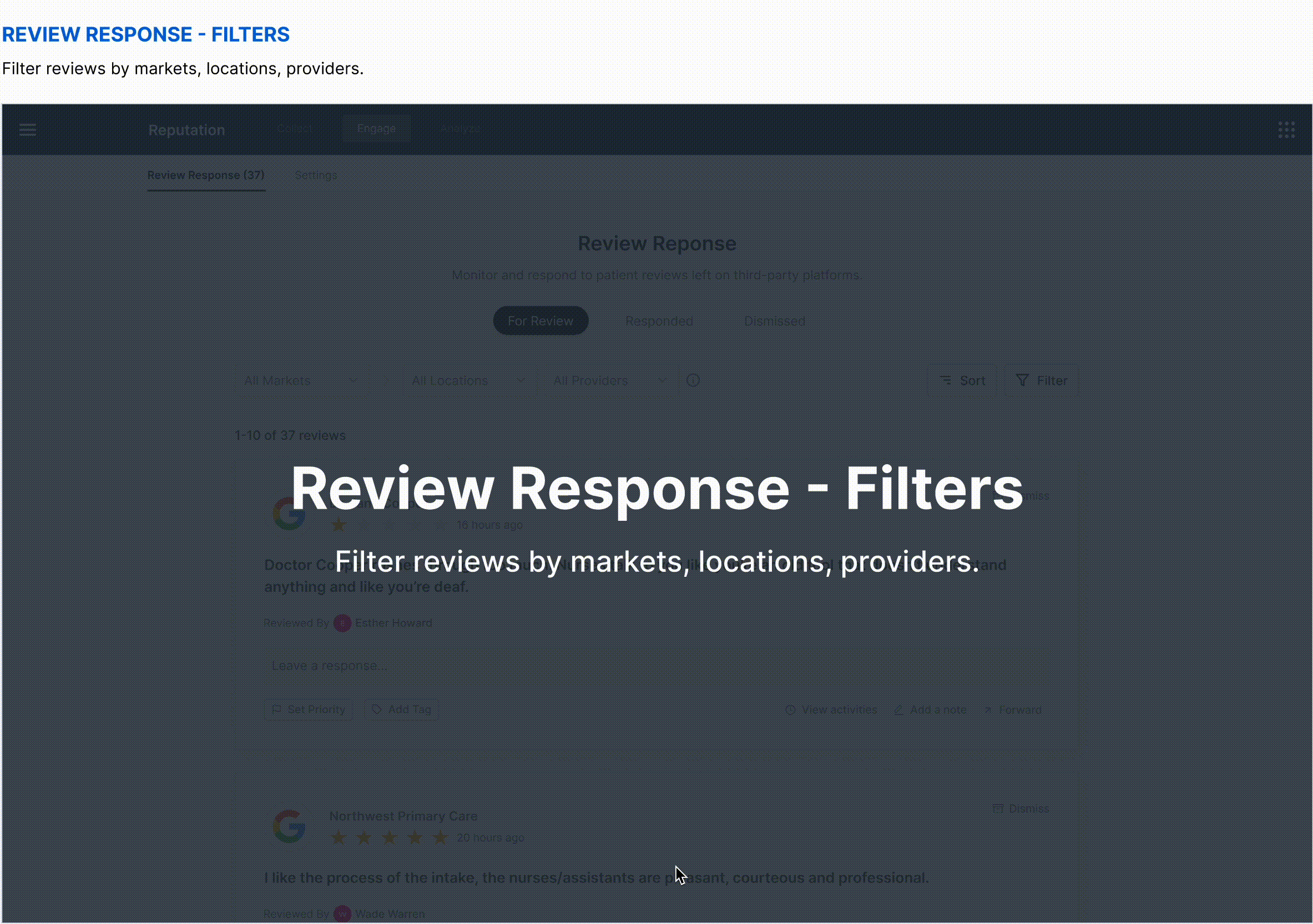
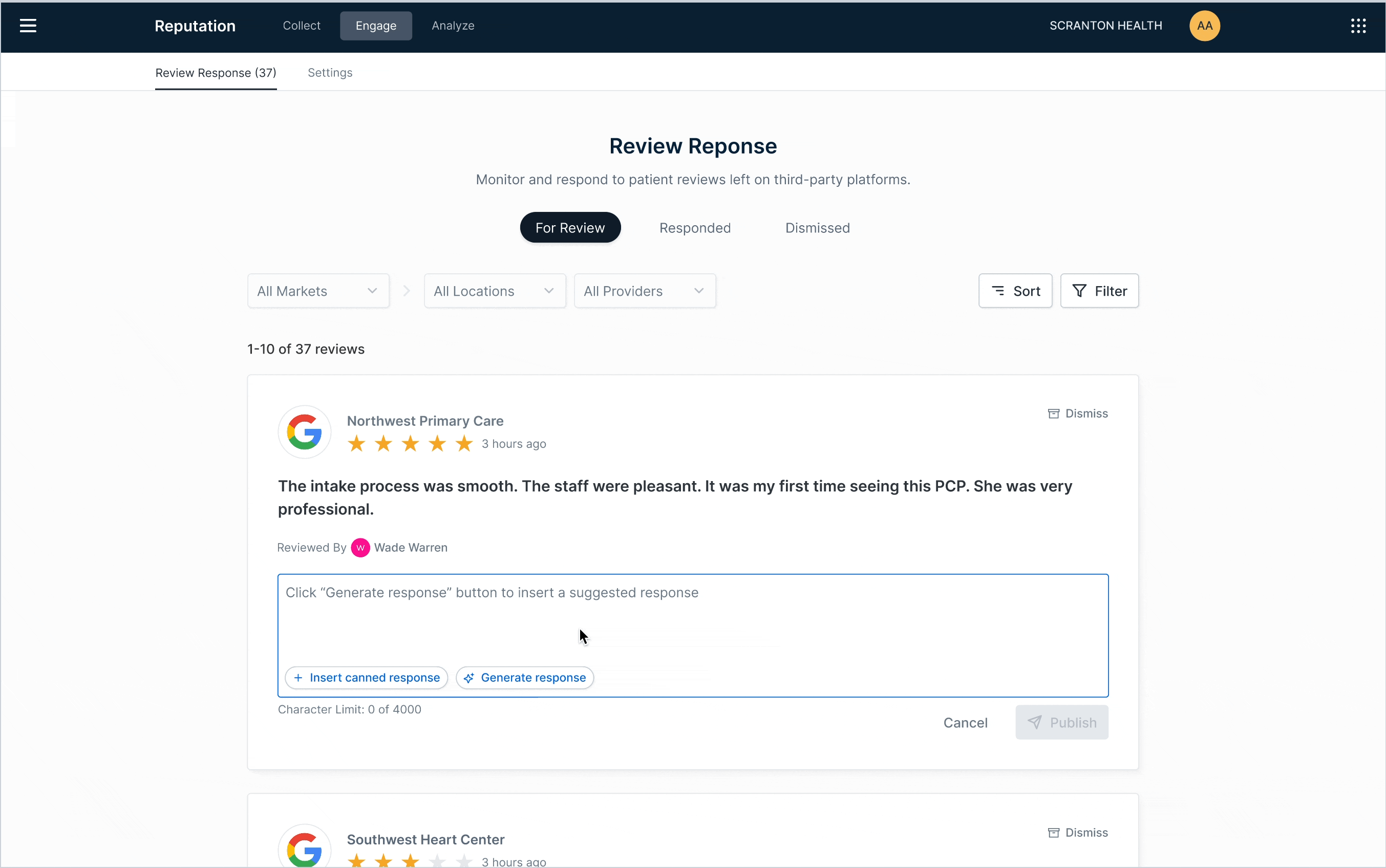
“Engage” - Review Response MVP
💁🏻♀️
Overview
We started the product with the Review Response feature to help users "engage" with consumers, as this simple yet crucial functionality would bring immediate value to our clients. Without such a tool, users had to go to each listing manager’s website separately to respond to reviews.
Design goal: Enable users to respond to online reviews directly within our product.
Challenge: Users had significantly different ways of managing reviews with their existing tools. My focus was on identifying the common needs and ensuring the MVP addressed these core needs effectively without favoring a specific workflow.
Outcome: I designed the MVP with all the basic functionalities, ensuring it was flexible enough to meet the diverse needs of different users. I also worked with engineers to figure out data dependencies and mappings, ensuring a streamlined experience on the UI.
‣
View data dependencies and design details
DATA DEPENDENCIES
We had a listing management product that handled clients’ listings, including third-party integrations, account linking, data mapping, and listing lifecycle management. By leveraging the existing data from that product, we were able to seamlessly power the reviews feature in this new product.
As the designer for both products, I worked closely with engineers on the online reputation team, helping them understand data dependencies, groupings, and inquiry logic. I also facilitated collaboration between engineers across the two teams.
DESIGN
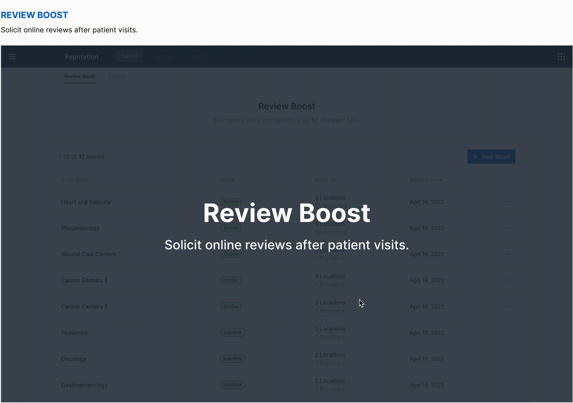
“Collect” - Review Boost MVP
💁🏻♀️
Overview
Once users could respond to reviews within our product, the next major step was to help them acquire more reviews. This process had been a huge pain point for our clients, as even with existing tools, a large portion of the process was still very manual.
Design goal: Enable users to solicit reviews easily from consumers after visits.
Challenge: My task was to design an innovative solution to address a huge pain point. With only one client to interview, whose experience was very specific to their existing tool, my challenge was to extract key insights and develop a streamlined solution that would simplify the experience for all users.
Outcome: I designed the MVP of the review boost feature to specifically address some needs and pain points of health systems, which generated a lot of excitement among potential clients.
‣
🧐 🧐 View more about the process and design highlights ✨
RESEARCH
Initially, I was only able to interview one client about their existing review solicitation process. Their process was very specific to the tools they used and the limitations they faced. To design despite the research constraints, I mapped out their flow, listed my observations, assumptions, and noted remaining questions that I got to further validate by secondary research and informal discussions with other clients, as opportunities arose.
DEFINE
After an iterative process of research and ideation, I summarized user’s JTBDs and came to the following user flow for the review boost feature:
DATA DEPENDENCIES
Configuring review boosts required matching data from EHR databases with third-party online listings to send review invitations after new visits were recorded in the EHR. This was previously a manual, daily task for the users. By leveraging the data foundations of our other products, we were able to greatly streamline the process and automate it on the backend.
At the time, another team had just started building standardized APIs for EHR integrations. I conducted extensive research into the information hierarchy of EHR databases and collaborated closely with engineers to identify what data we could leverage, how to map it to listings, and how to use it to simplify the user experience.
DESIGN
With the flow in place, I collaborated with my PM to define the scope for each step and designed a solution that specifically addresses the needs and pain points of health systems.
Highlight 1: Volume Split
Patients receive review invitations for either their provider or the location they visited. Health systems previously had to manually split review volume between locations and providers by visit types, then constantly monitor and adjust to achieve the desired outcome. My design lets users set a desired volume distribution, which is then managed fully automatically on the backend, significantly reducing their workload.
Highlight 2: EHR Integrations
I worked closely with PMs and engineering teams to understand the complex data integration and matching logic, ensuring these processes were all handled properly on the backend. This allowed me to streamline the process and enable users to only focus on their main jobs to be done.
Highlight 3: Visit Type Filters
Health systems use visit types to decide which patients receive review invitations. Visit types can be really confusing, often similar for providers under the same specialty but could be different for each provider. My design abstracts this to the location level for efficiency in configuring boosts, with hints to inform users of any edge cases.
Highlight 4: Flexible Delivery Settings
User can configure both SMS and email in order to maximize the boost volume while being fully compliant with the TCPA regulations. Users have the flexibility to either use globally configured templates, or customize for each boost.
Highlight 5: Summary & Review
The summary page allows users to review and confirm all the settings they’ve configured, before starting to send out messages to the patients. The users also have the option to save it as a draft for future activation.
OUTCOME
This feature significantly streamlined the review invitation configuration process, boosting user efficiency. It immediately caught the attention of an enterprise-level client, who requested a trial to replace their existing manual workflow.
asdf asdf adsf asdf asd asdf
/
Adding to “Engage” - Canned Response
💁🏻♀️
Overview
With the completion of all the key MVPs, our immediate follow was the canned response feature, to improve one of our key metrics - response time.
Design goal: Enable users to respond to reviews more efficiently through pre-configured response templates.
Challenge: With limited research resources, I had to design based on many assumptions, and ensure that my design was flexible enough to accommodate various potential user needs.
Outcome: I designed and prototyped functionalities for both configuring and applying canned response with a flexible labeling system. However, we later decided to scope down and ship a minimal version first because of changes in client needs.
‣
🧐 View more about the process and prototypes
RESEARCH
Without many opportunities for direct user research, I conducted a lot of secondary research, including identifying the benefits and risks, understanding industry best practices, analyzing actual responses, listing down my questions and assumptions, etc.
KNOWNS
Responses for positive and negative reviews are different.
Responses, especially for negative reviews, often follow a pattern with several fixed components.
UNKNOWNS & ASSUMPTIONS
I didn’t know if users always use complete response templates. By analyzing our competitors’ products, I assumed some users would create templates for different parts of a response and combine them as needed.
I didn’t get to know how many templates users usually have. I assumed that while some users have a few templates, some might have a lot, especially if they create templates for each part of a response.
DESIGN
With all the knowns, unknowns, and assumptions, I decided to create a canned response feature with a labeling system that’s flexible enough to accommodate different types of use cases.
While the design and prototypes were in place, as we started to sign contracts and learn about the immediate needs of our initial clients, I learnt that our initial clients only have a few response templates. My PM and I decided to ship a minimal version first, and save the rest of the design for future iterations.
Adding to “Engage” - Service Recovery
💁🏻♀️
Overview
While working on the previous features, I learnt that many users would escalate online reviews for a process called “service recovery”, to have the team address the negative feedback as early as possible. This is a critical workflow for health systems, as it plays a key role in patient retention and maintaining their reputation.
Design goal: Enable users to escalate and manage reviews for service recovery effectively.
Challenge: Clients have very different processes that involves various stakeholders. Extracting common needs and scoping were the key to the success of the MVP.
Outcome: I designed new service recovery functionalities on top of the existing review response feature. By leveraging insights from previous usability tests and task analysis, I iterated on the layout of the review card, adding more actions while maintaining an intuitive user experience.
‣
🧐 🧐 View more about the process and UI iteration
RESEARCH
I did some secondary research, competitive research and client research to understand what service recovery is about, how it usually works, and the specific processes that our clients have.
INSIGHTS
During discovery, I learnt that our clients have really different processes for service recovery. Some used a ticketing system to track the end-to-end process, while others simply hand off to other teams through emails with screenshots. I also discovered that service recovery is a process that could involve multiple stakeholders beyond marketing, which was the main target user group for our product.
SCOPING
Although we really wanted to help make the whole service recovery flow effective for health systems, my PM and I decided to stay focused on what marketing users need, and have a minimal version for quick validation.
TASK ANALYSIS
With that in mind, I listed down and grouped all the common tasks that marketing users need to perform, and incorporated these tasks into our existing review response flow to make a lightweight version of the service recovery feature.
USABILITY TEST
I conducted this usability test before I started designing the service recovery feature. I anticipated that we would need to add more user actions to the review card, so I wanted to gather some user feedback while I had more time, to help guide any quick iterations we may need in the future. I ran an unmoderated usability study on dscout, where participants interacted with three different prototypes, each with four actions on the review card.
Two key insights informed my design of the service recovery feature:
The ‘X’ icon to dismiss the review was confusing to some users.
Although users liked all three prototypes, they particularly appreciated the third one, where all actions were on the same level, especially since the escalate action wasn’t hidden.
DESIGN
Iterating on User Feedback - Review Filters
💁🏻♀️
Overview
After over a year of hard work, we finally launched our product, and had our first client begin using the review response features! The first feedback I received from real users was their need to filter reviews by markets, locations and providers.
Design goal: Enable users to easily filter reviews by markets, locations and providers.
Challenge: It was a complex filter set due to the dependent relationships between markets, locations, providers and their listings. I iterated on multiple approaches, going through rounds of design, prototyping and usability tests.
Outcome: I designed a set of flexible filters that aligns with user’s mental model, allowing them to easily filter as needed. I clearly communicated the design and interaction details to the development team through prototypes, videos, and annotations.
‣
🧐 🧐 View more about the process and interaction details
USER NEEDS
While the client were generally satisfied with responding to reviews, selecting which reviews to address was still challenging. Their team structure required some users to have admin access to all reviews but only respond to reviews under certain markets, locations, etc.
The relationships between markets, locations, providers, and their listings are complex. I started by identifying the major use cases my design should prioritize based on the user needs:
View all reviews for a market
View all reviews across multiple locations, including both location listings and all provider listings
View all reviews for specific location or provider listings
DESIGN ITERATIONS
I went through rounds of design, prototyping and usability tests with colleagues and our client.
MENTAL MODEL
The data relationship between markets, locations and providers are complex, and they are interrelated. The usability tests with the client helped me realize that my assumption of the their mental model was not accurate. I assumed that they would be clear on the difference between location as a grouping vs. location as a listing. However, they were actually confused by that concept.
FINAL DESIGN
Strategic Planning - Improving Response Time
With the core table-stake features in place, our next step was to further improve the product guided by product metrics and user needs. We primarily focused on improving response time, a critical metric for our review response feature.
Our team brainstormed several ideas to enhance response time. To assist my PM in developing a strategic plan, I broke down the ideas into smaller tasks, consolidated insights from sales conversations and client meetings, and created diagrams to help determine priorities. Since our focus at that time was on sales enablement, we prioritized features not only based on their importance to current and prospective customers but also on how we could better showcase our future capabilities to prospects.
Embracing Innovation - AI Generated Response
💁🏻♀️
Overview
Among all the ideas we explored to improve response time, AI generated response was particularly interesting.
Design goal (initial): We started with the idea of fully automating review responses, as we focused on sales enablement and wanted to showcase exciting roadmap features to win deals.
Design goal (after research): After user research, we decided to narrow our focus to enabling users to respond to reviews more efficiently through AI suggested responses.
Challenge: Given a broad and ambiguous idea driven by market interest, the biggest challenge was to determine if the idea itself made sense and how to develop a solution that truly benefits users and meets our business objectives.
Outcome: I conducted user interviews to understand their needs and perceptions around automating review responses. This research led to a concrete solution that addresses user needs while driving sales. I delivered the design and also collaborated with the AI Labs team to train the model behind the feature.
‣
🧐 🧐 View more about the process
INTERVIEWS
With the rise of generative AI technology, our team started to explore the idea of fully automating responses with AI, not only because it aligned with our strategy of reducing response time, but it was also the hot topic in all sales conversations. Despite the excitement, I felt it was such a broad and ambiguous idea, and I was a little concerned about how helpful the feature would be to our relatively “conservative” healthcare clients.
With so many unknowns, I decided to hold off on diving into design, and instead collaborated with my PM to conduct some quick interviews with clients. We aimed to understand:
❓ What automated responses mean to them.
❓ How helpful they think automated responses could be.
❓ Any concerns they have with automated responses.
❓ Their expected level of control over the responses.
❓ Any guardrails they think would help make the feature truly helpful.
INTERVIEW RESULTS
We interviewed three clients and gathered additional information from others. The insights we gained was invaluable:
✅ Automating for reviews with no comments
All users liked the idea of automating responses for reviews with no comments.
❌ Automating for reviews with comments
While some users do automate responses to positive reviews, most prefer to read all reviews before responding, even to positive ones.
✅ Suggested responses
All users liked the idea of AI suggested responses, as they improve efficiency without taking away any control.
DESIGN
Based on the insights, we prioritized using generative AI to suggest responses for all reviews with comments. The design was kept very lightweight and straightforward, as the magic happens through the AI model that powers this feature.
COLLABORATING WITH THE AI TEAM
The key to the success of this feature was a close collaboration between our team and the AI Labs team, through clear communication, transparent feedback sharing, regular sync-up meetings, etc. Drawing from previous interviews, we gathered many insights that guided the model's development. I worked with my PM to consolidate our research findings into guidelines for model training. We also documented possible model inputs, training ideas we brainstormed, and experiments we conducted with ChatGPT on a FigJam board for clear communication.
MORE WORK ON MY TEAM
My work extended beyond just design. While the AI Labs team focused on model development, I collaborated closely with my PM and Engineering Manager to refine the data requirements, product guardrails, and success metrics.
OUTCOME
With the collective effort of our team and the AI Labs team, we completed a demo prototype that attracted a lot of prospects, while steadily progressing toward a fully functional feature.
Outcome and Impact
✅ ACQUIRED 5 ENTERPRISE CUSTOMERS
As of writing this case study, our product had already gained traction with one happy client actively using it, two clients nearing their onboarding date, and two more who had signed contracts. Additionally, one client was negotiating a product trial as they recognized that our review boost feature was far more efficient compared to their existing tool. We also have a strong pipeline, with numerous prospects showing interest in the product.
✅ 2.3M TOTAL CONTRACT VALUE
While I primarily focused on developing the Online Reputation product, I later became the designer for the entire Reputation product suite, supporting two additional products. Online Reputation was sold as part of the suite, helped make the suite a standout option to the customers, attracting lots of interest and resulting in a total contract value of $2.3M.
Learnings
It was an interesting and rewarding experience to navigate all the challenges and ambiguities throughout this design process. I collaborated with a director, multiple PMs, engineering teams, UX researcher, AI team, sales, customer success, etc. I learnt to be versatile, flexible, quickly adapt to changes, and stay focused despite all the context switchings. I’d also be happy to share more about these experiences: